Look into React Website
January 14, 2020
Preamble
First post for 2020 🎉. Probably post a year in review soonish… Welcome back to our projects or work :)
The #1 advice I always give to uni students is to code as much as you can. Try to find something you are passionate about and code it. I think that is the best way to get started in the software industry but at some point you will start to get curious and start reading the open source code you use every day and realise you don’t know a whole lot. Don’t feel bad it doesn’t mean you are dumb, it just means there is a lot to software.
To improve it is important to read other people’s code to get inspiration for new patterns that you can adopt in your projects. We will do just that by taking a look at https://reactjs.org
The High Level
At its core its just a static site created in Gatsby. Its interesting why they did not use their own create-react-app I am guessing its because Gatsby is already optimised for building fast websites with great SEO.
Key tech
- Gatsby - Framework for building static websites follows JAM stack you can read more here
- Glamour css (css in js library)
- React Live (React editor)
- Flow - A lightweight static type checker for js.
Key decisions
- Clear separation of code and content in most cases
- No ui library most css is hand written using css in js
- No tests, the ci pipeline only runs linting, formatting and type checking
- No git hooks! (Thank God)
- Minimal to no comments
- Files are structured with most important code at the top to least important (imo)
- Uses a seo component in every page
Let’s dig to each point to understand the why 🕳
Separation of code and content
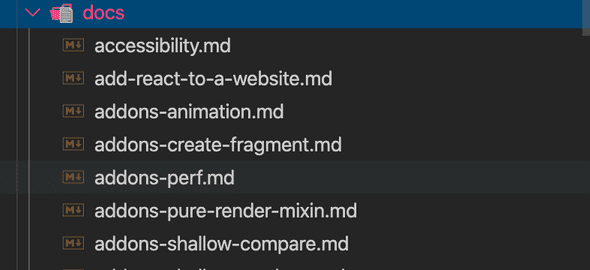
Gatsby encourages this through its graphql api thats generated from different data sources. You specify these sources it can be from a website like contentful, an api like twitter or most commonly from your file system. In this case the Facebook team has created a folder aptly name content which holds most of the websites content for example the documentation

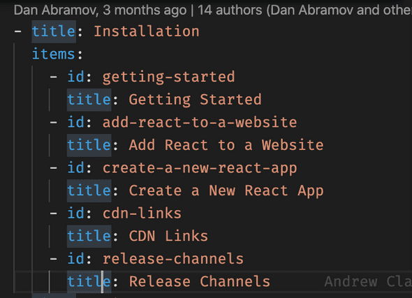
Additionally they do it for other things like links too e.g. nav.yml

and a bunch of other stuff like people’s names, versions and languages basically content that is likely to change. The intention of doing this separation is to make code easier to read with fewer lines to parse, better maintainability since files are easier to find and you can easily differentiate from a low risk content change and a high risk code change.
Writing our own UI library FTW!
UI libraries have always been a cause of pain and joy. On the one hand they provide a lot of useful well tested components that you can drop into your app and it works. But if there is even a hint of a need for customisation shit starts to get real. Their massive API surface is the only bridge to the jungle of layers of abstractions.
In this case the Facebook team has chosen to write their own mini UI library which I think they have done really well. Under the components folder there is a collection of simple general ui components.

They don’t include any app specific logic and instead use composition (using children prop) to add that kind of stuff which is provided by another component which reads the content from either a .yml file or from the GraphQL API (so much encapsulation :O) so it ends up something like this
<Header>
  <HeaderText>
</Header>


// Header Text

import content from './some.yml'

...

<div>{content}</div>
theme.js holds most of the site’s css. It contains things like colors, breakpoints, font sizes for different types of text and it changes according to the screen width, styling for links
const SIZES = {
  xsmall: { min: 0, max: 599 },
  small: { min: 600, max: 779 },
  medium: { min: 780, max: 979 },
  large: { min: 980, max: 1279 },
}

const colors = {
  lighter: '#373940', // light blue
  dark: '#282c34', // dark blue
  darker: '#20232a', // really dark blue
  brand: '#61dafb', // electric blue
};

const fonts = {
 header: {
    fontSize: 60,
    lineHeight: '65px',
    fontWeight: 700,

    [media.lessThan('small')]: {
      overflowWrap: 'break-word',
      wordBreak: 'break-word',
    },
 }

 const media = {
  greaterThan(key: Size) {
    return `@media (min-width: ${SIZES[key].min}px)`;
  },
};
Generally a theme file for UI frameworks contain the custom branding for the website and will include colors, fontsizes and breakpoints however in this case it includes a bunch of other stuff like the responsiveness and styling for specific things like links and headings. This makes the file huge at 450 lines, this specific code should belong in its respective components and leave the theme.js as a place to configure the existing styles rather than writing styles for components.
To build responsive websites we use the media query api which will conditionally apply css depending on the screen width. For me the api has always been hard to remember so I love what they have done here, by writing a little helper function on top of the media query api.
const media = {
  greaterThan(key: Size) {
    return `@media (min-width: ${SIZES[key].min}px)`
  },
}

// Example usage

[media.greaterThan('large')]: {
   // These styles are conditionally applied
   fontWeight: 100
}
it makes code a lot more readable.
Are tests useless 🤔
Writing frontend tests whether they are unit or integration can be hard. It is generally related to the complexities with rendering the DOM in an isolated context. You end up having to mock out a ton of stuff like authentication and props which tend to break the app so you have to do it in a way that doesn’t break the app but then you write all this new code and in the end after you finally have the test passing you have to ask yourself is it actually testing anything? As you can imagine this is all VERY TIME CONSUMING.
This doesn’t mean you shouldn’t write frontend tests too because there are a lot of benefits that come with it the main one being that there is some confidence that the code change you make won’t break another part of the app. In this case only linting, formatting and type checking are used there are no conventional tests. The reason being I think is to do with time but also the nature of this app. It’s mostly just a static site with little state. If you keep state to a minimum this simplifies your app a lot. Finally tests have their own maintenance overhead. Its very annoying having to update them every time you make a code change so people don’t and they become meaningless…
No to git hooks
A lot of projects tend to use husky which will run certain commands on specific git commands. e.g. run tests on a git commit. In my experience git hooks have been buggy and only run for some people. In addition they slow dev process down e.g. running tests every time you make a commit. Running all those things in the CI is enough assuming you can trust your team to not make trivial errors like not formatting their code.
Keep comments to a minimum
No one ever reads comments. They will rather wrestle with the code than to read your page long comment on why this function returns a boolean instead of a string. In some cases it can have the opposite effect making code harder to read because there are so many lines on the screen. If you reach for that paragraph then its time to refactor.
SEO is important too
The TitleAndMetaTag component holds most of the <head></head> elements
<Helmet title={title}>
  <meta property="og:title" content={title} />
  <meta property="og:type" content="website" />
  {canonicalUrl && <meta property="og:url" content={canonicalUrl} />}
  <meta property="og:image" content="/logo-og.png" />
  <meta
    property="og:description"
    content={ogDescription || defaultDescription}
  />
  <meta property="fb:app_id" content="623268441017527" />
  {canonicalUrl && <link rel="canonical" href={canonicalUrl} />}
  {canonicalUrl && (
    <link
      rel="alternate"
      href={defaultPage(canonicalUrl)}
      hreflang="x-default"
    />
  )}
  {canonicalUrl && alternatePages(canonicalUrl)}
</Helmet>
This is useful for search engines and websites to understand your website. The og prefix is using the open graph protocol which websites like Facebook use to help determine the metadata of your website so they can use it for things like a preview of the website.
Finish 😅
So that was my quick glance at the React website hopefully this will inspire you to dig into other code bases. If you do make sure to share with me what new cool patterns you discover!
Written by David Yu who loves to build things in code.You should checkout our facebook for latest events and news